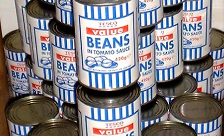
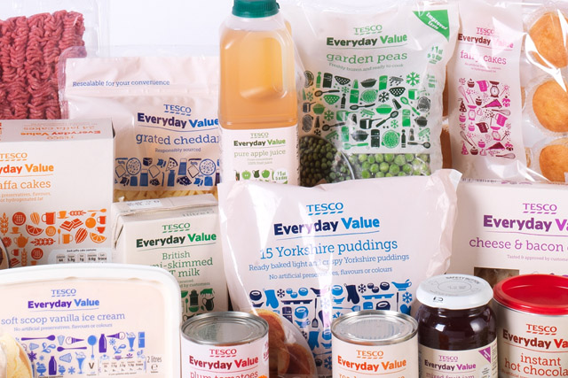
Graphic design plays a key roll in consumerism of goods and can be seen in every supermarket across the world. Tesco has had a ‘value range’ in store for the past 2 decades, but in recent years they have transitioned it into an ‘everyday value’ range. Rocket design consultancy was utilized to create both the old packaging and rework it. The old packaging design included only three colours. Blue, white and red. These symbolised that the company was british. The blue stripes were inspired by the striped carrier bags the company used. As well as this, the word ‘value’ was indiscreetly highlighted by a red box, this drew attention to the fact that it was a cheap range. Customers have argued that the packaging looked cold, unemotional and stated that there was often shame associated with buying the blue striped products. They stated that just because it is a cheap and basic brand, it doesnt have to look basic. To the new packaging Rocket added a cream background as well as a wider palette of colours and icons. There is also imagery of the product included on the front of each package, giving it a sense of individuality. The red box containing the word ‘value’ no longer exists however the audience can still identify that it is a value range due to the fact that the packaging is more simple. Essentially the aim of the new packaging has been to make the brand look warmer and less basic and i believe that Rocket has successfully done this using a number of these elements.


