Graphic Design and Places

fig 1.

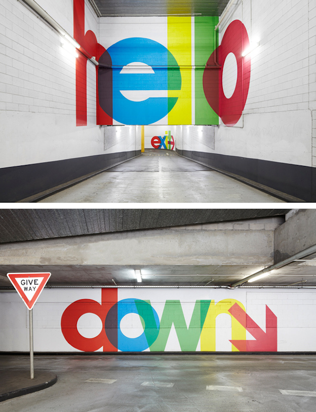
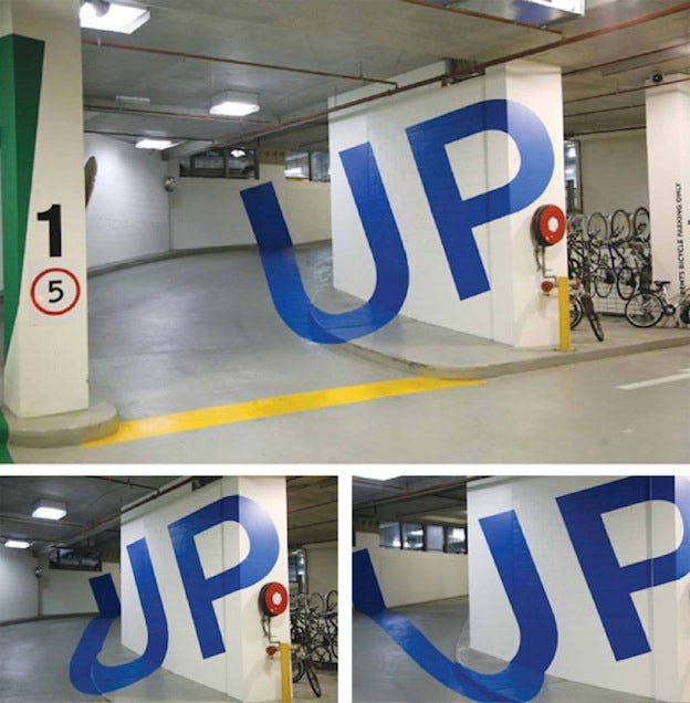
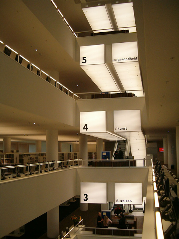
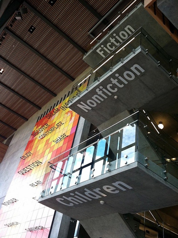
Graphic design can be loosely defined as ‘communication through words and imagery’. It plays a key part in our everyday lives and is all around us. One example of graphic design and places are ‘wayfinding systems’. Wayfinding forms the core of what experimental graphic design can do to improve peoples experience of a place. Without wayfinding forms we would have a lot more trouble navigating places and buildings, wayfinding systems are a key function of graphic design in everyday urban life. Fig. 1 shows us examples of graphic design used in a multistory car park. It uses modern and colourful dseign to help cars navigate their way around the complex. Fig. 2 is an example of how graphic design has helped direct people to their desired place in a library space. In the first example, the floor floor numbers are clearly and very visibly marked the whole way up the atrium as well as the genre of book on each floor and in the second example the genre of book can be seen on the stairs from the ground floor. Both of these examples give modern vibes but are efficient designs and do their jobs.

Making an old pin shiny

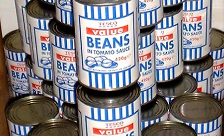
Graphic design plays a key roll in consumerism of goods and can be seen in every supermarket across the world. Tesco has had a ‘value range’ in store for the past 2 decades, but in recent years they have transitioned it into an ‘everyday value’ range. Rocket design consultancy was utilized to create both the old packaging and rework it. The old packaging design included only three colours. Blue, white and red. These symbolised that the company was british. The blue stripes were inspired by the striped carrier bags the company used. As well as this, the word ‘value’ was indiscreetly highlighted by a red box, this drew attention to the fact that it was a cheap range. Customers have argued that the packaging looked cold, unemotional and stated that there was often shame associated with buying the blue striped products. They stated that just because it is a cheap and basic brand, it doesnt have to look basic. To the new packaging Rocket added a cream background as well as a wider palette of colours and icons. There is also imagery of the product included on the front of each package, giving it a sense of individuality. The red box containing the word ‘value’ no longer exists  however the audience can still identify that it is a value range due to the fact that the packaging is more simple. Essentially the aim of the new packaging has been to make the brand look warmer and less basic and i believe that Rocket has successfully done this using a number of these elements.

Unapologetic

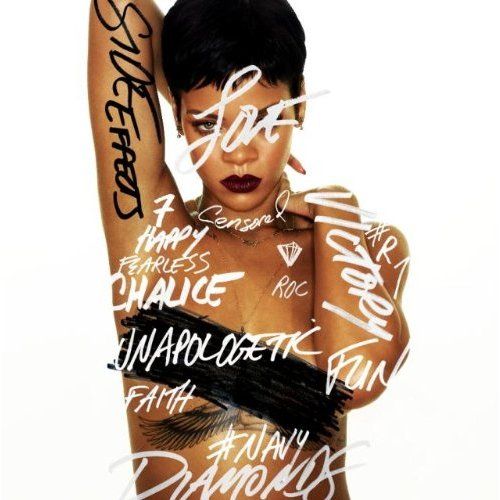
Graphic design is more than often used to sell a product and behind every good CD cover is a good graphic designer. The designer behind the cover for Rihanna’s ‘Unapologetic’ record used many different mechanisms in order to grab an audiences attention. For example, they have made sure that she is looking directly into the camera, this makes it seem as though she is looking directly at her audience. This is known as direct address and makes the consumer feel closer to the audience through eye contact. The designer has also made sure to include a ‘parental guidance’ warning to make sure the audience know that some of the songs are explicit and contain swearingor foul language. The white background puts all the focus on the focal point, the musician whose confident stance and lack of clothing reflects the album title.

The Godfather

The Godfather film poster 

The film poster for ‘The Godfather’ is an iconic example of excellently produced graphic design. It includes a simple, 3 palette colour scheme which is both striking and informative. The black and white signifies that the movie is of the film noir genre, however it also give us an insight into the content of the movie with the contrasting colours representing good and evil, the audience is able to identify that there will be a battle between these two in the film. The only other colour used on the poster is red. Red can be symbolic of several different things including; anger, rage, blood and revenge which gives this poster the connotation that the movie includes these elements. The title of the movie was also cleverly created with imagery of a hand holding puppet strings to represent the power and control that the godfather has over his empire and how he essentially ‘pulls the strings’ with his men dancing on the end and undertaking all his orders and work. Another thing worth mentioning is that the face on the poster does not appear to show any emotion, the eyes are blacked out and this combined with the contrasting black and white colours gives it an overall sinister atmosphere.